Strawberry Fields Festival
Festival Rebranding | Summer 2023
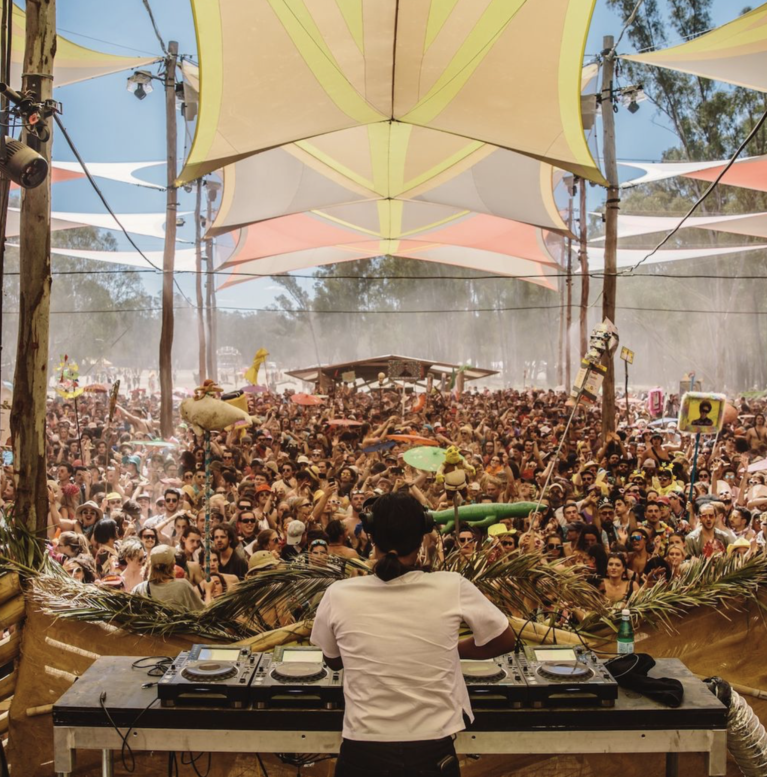
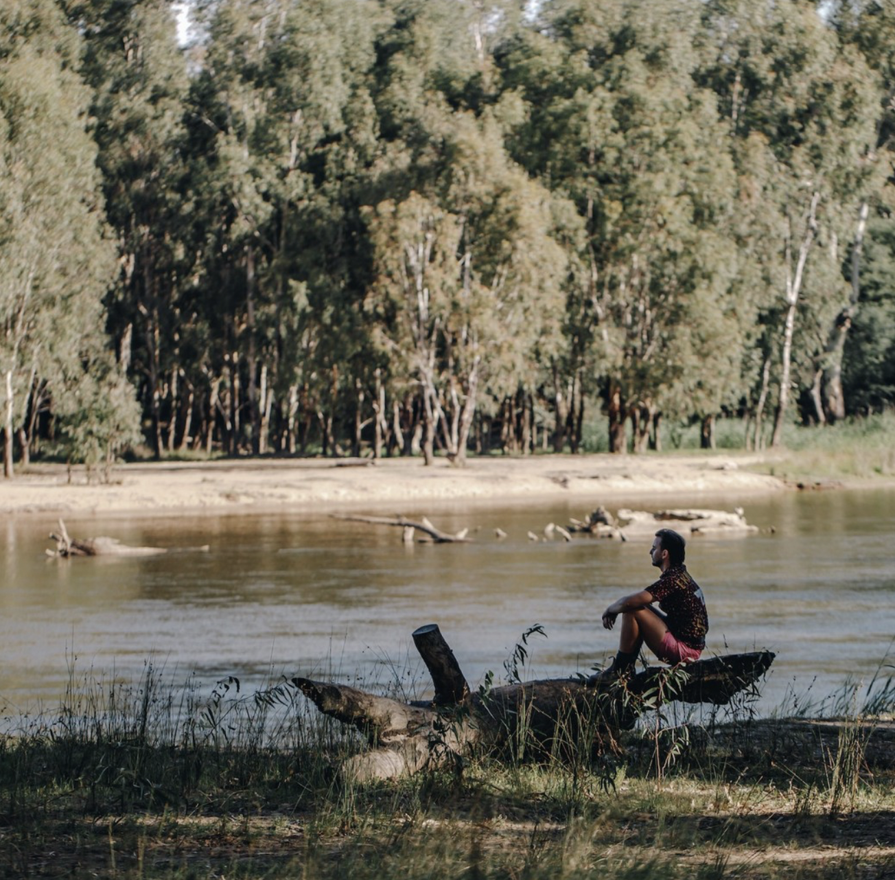
Strawberry Fields is an annual music and arts festival held in Tocumwal, New South Wales, Australia. It celebrates underground electronic music, immersive art installations, and community-focused experiences in a natural bushland setting along the Murray River. The festival is known for its sustainability efforts, vibrant visual art, and inclusive, transformative atmosphere. The goal of this rebrand was to visually redesign the logo and brand presence, crafting a cohesive identity that reflects the festival’s vibrant, transformative atmosphere.

Mission Statement
Strawberry Fields Festival aims to create a creative and dynamic experience in one of the most stunning natural environments Australia has to offer. It provides a space that allows attendees to bask in the revelry of four days of live music, large scale art, workshops, and wild river swimming.
Event History
Strawberry Fields Festival was founded in 2009 by a trio of young dreamers. Starting with less than 1,000 attending, the festival now has grown to attract attendees from across the globe and solidify our reputation as one of Australia’s best known festivals to experience art, music & camping.

Target Market
This festival is catered towards free spirits who have appreciation for the arts and are above the age of 18. Strawberry Fields tries to create awareness and encourage people to take care of the planet and its communities by involving eco-conscious individuals.
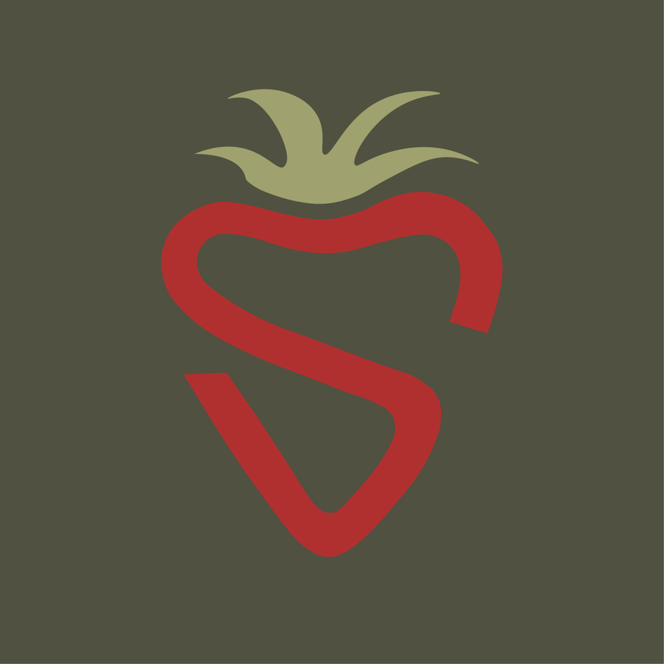
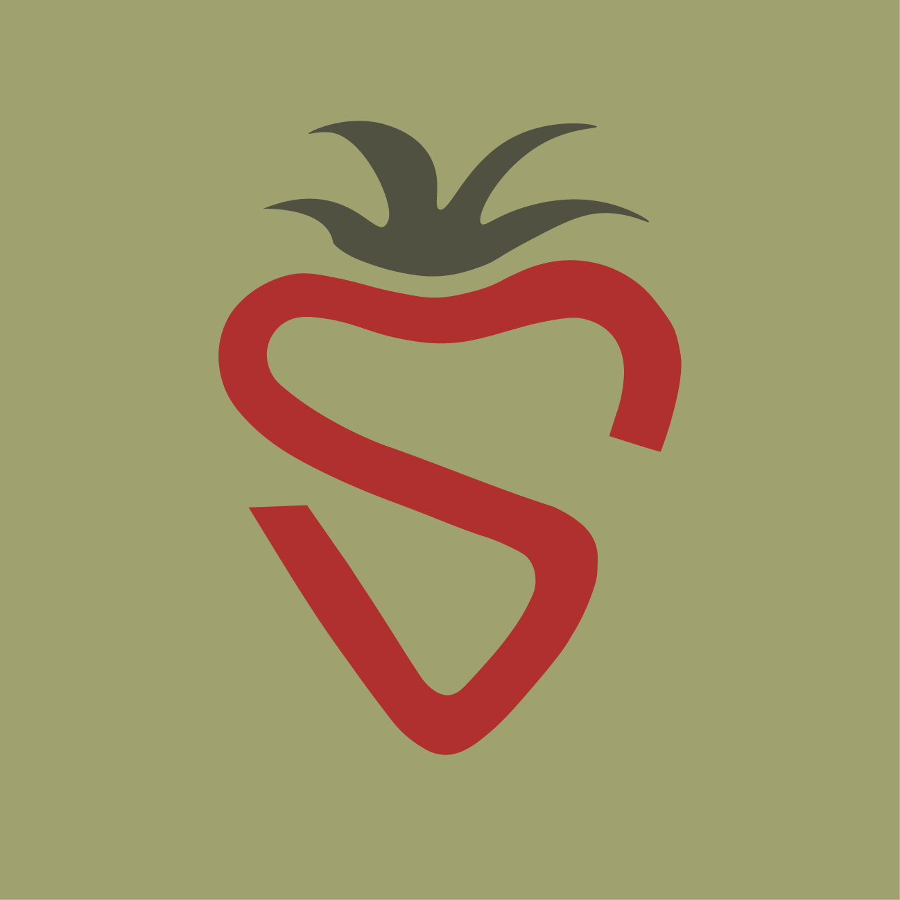
Current Identity
Opportunity Assessment
Current Logo
I plan to address the typography, negative space and movement found (/not found) in the current identity system. By addressing these areas, I hope to be able to visually represent the brand more logically and professionally.

Typography
The current identity of this festival does not include typography. There is no element within this logo that gives the viewer any information about this festival or what it is.
Negative Space
The opportunity to explore negative space within this logo could benefit the overall design . This current logo feels very static and adding more dimension would better make a more dynamic logo.
Movement
The only key element of this logo is an upside down triangle. This logo doesn’t allow for the viewers eyes to be lead throughout the design. More movement within this logo mark would be benefital to include.
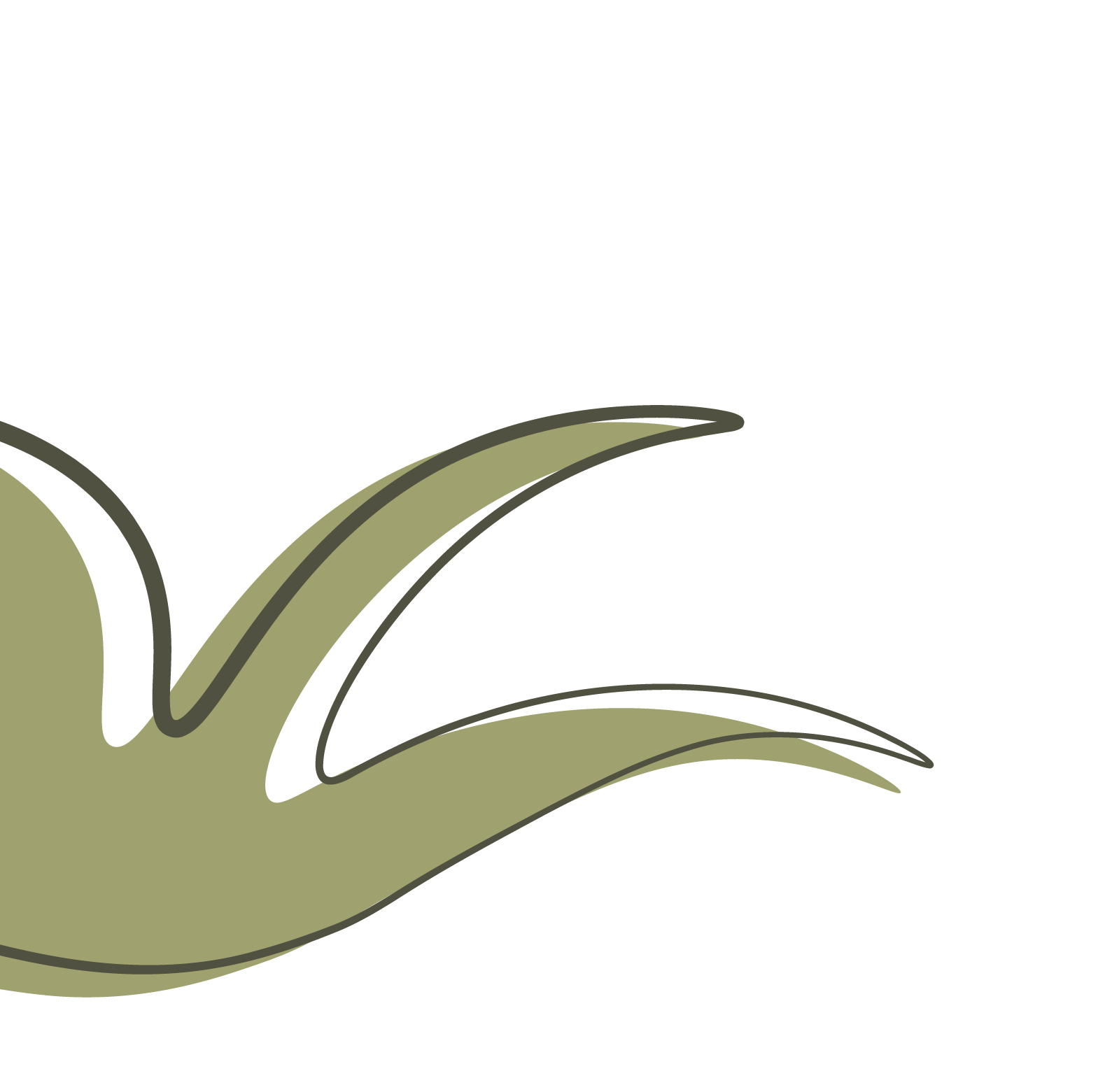
Opportunity Proposal


Revised Identity
Hand and Digital Sketches
Final Identity